Polyviz
3D modeling studio
Polyviz studio has purpose to share 3D stuff to the world, fusing art and technology to create inspired computer generated images. Here you will find really great completed scenes for reasonable prices, as well as some fantastic freebies.
Problem:
While developing the Polyviz website, I faced a key challenge: the need to combine functionality and ease of use. My goal was to create a resource that would provide quick access to products and simplify the purchasing process for professionals who are short on time.
Goal:
When I started developing the site for Polyviz, I had several key goals:
The goal was to create a website that would effectively convert visitors into buyers. This meant simplifying navigation, creating a user-friendly and understandable interface, and providing quick access to products and the purchasing process.
I wanted to make the site a resource that not only sells but also supports users by providing them with useful materials. It was important to create sections with use cases, training resources and reviews to increase trust and customer satisfaction.
The site was meant to not only serve as a marketplace, but also to reinforce Polyviz's positioning in the market. This included creating sections that would introduce the brand, its history, and its unique offerings, so that users would perceive Polyviz as a leader in 3D modeling.
Research:
After carefully analyzing user needs and site goals, I identified three key details that formed the basis for developing a successful interface for Polyviz. These details were critical to creating an effective and user-friendly resource that would meet our users' needs and achieve our goals. They included:
Understanding that users value their time and strive for efficiency led to an emphasis on fast loading and ease of use of the site. I focused on creating an intuitive interface so that users can easily find and purchase products, minimizing unnecessary actions and steps.
To demonstrate the value of the products and ensure credibility, I have included sections with real-life examples of successful projects and case studies. These materials show how Polyviz products solve specific user problems, providing clear and convincing evidence of their effectiveness and applicability.
An important aspect of the design was to create a visually appealing interface that attracts attention and helps users navigate easily. I paid special attention to the design of the product page so that it is not only aesthetically pleasing, but also provides all the necessary information about the scenes and models, including high-quality images and clear descriptions. This helps users quickly understand what they are getting and increases confidence in making a purchasing decision.
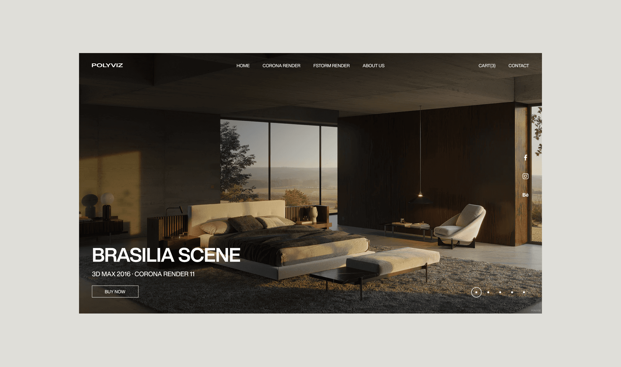
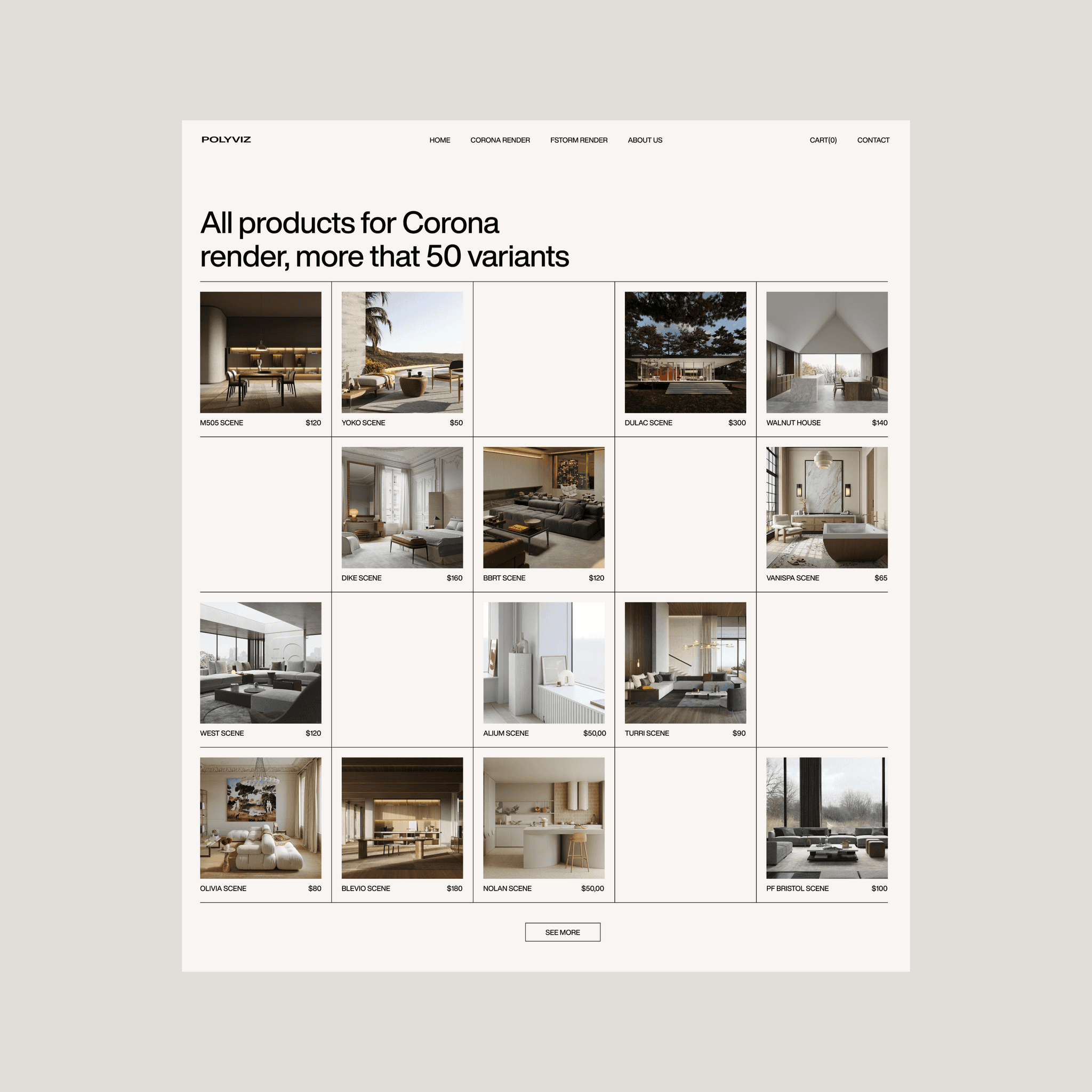
Shop section:
Problem:
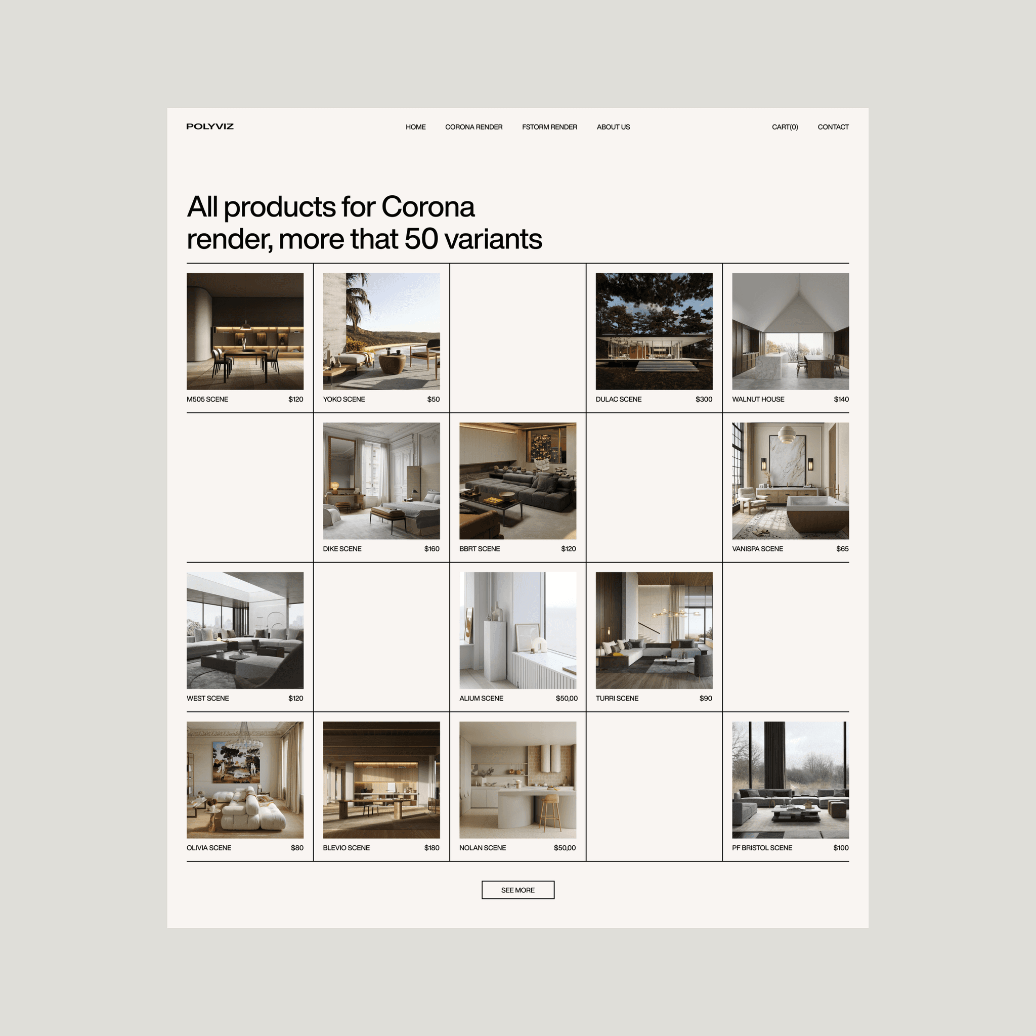
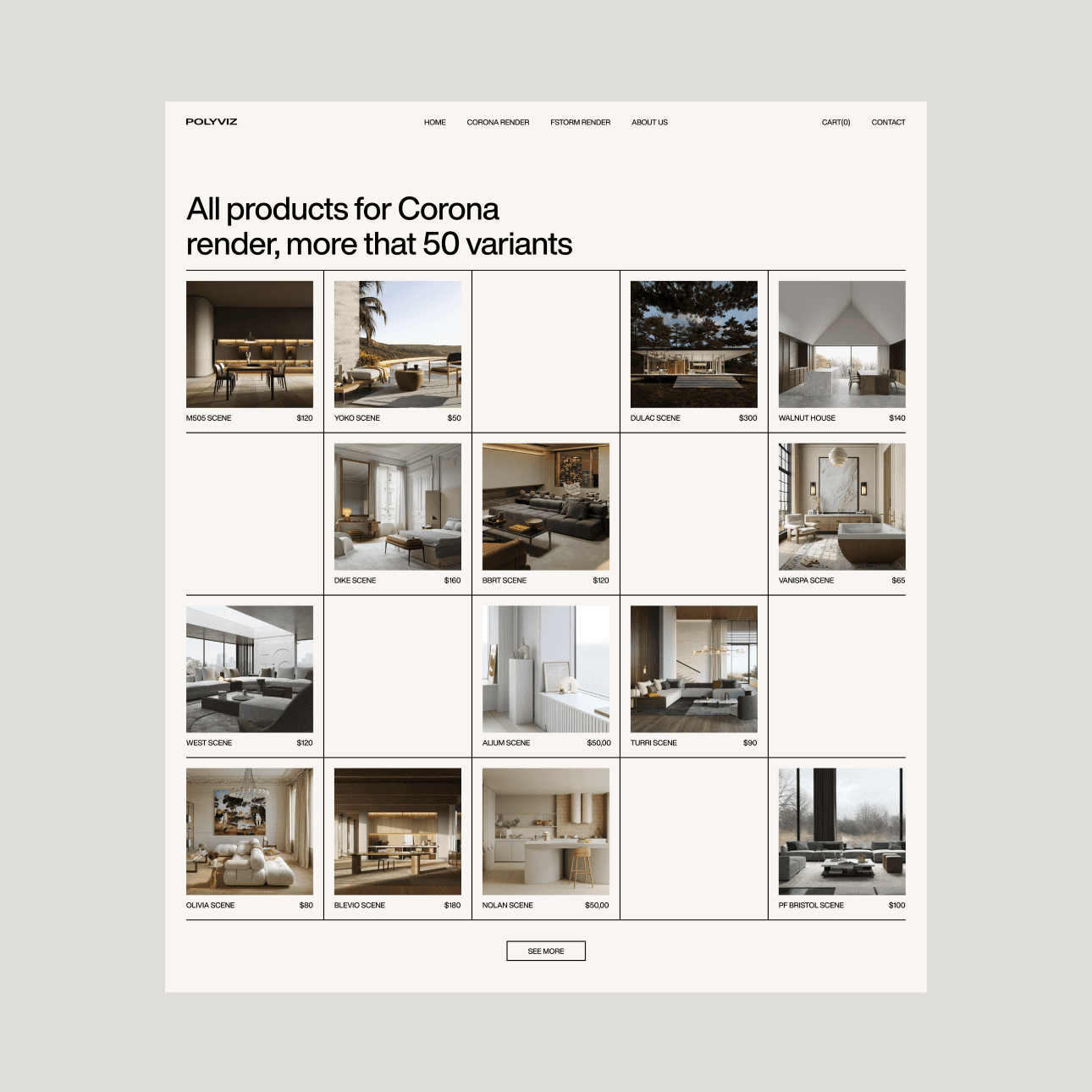
During development, I encountered the problem of inefficient display of a large number of scenes. Previously, the lack of a structured presentation created visual chaos, which made it difficult for users to find the desired scenes and evaluate them. This complicated the process of choosing and comparing products, which negatively affected the ease of navigation and the speed of decision-making.
Solution:
To solve this problem, I used a 4x4 grid. Each block in the grid displays one image of a scene, its name, and price. Clicking on a block opens a summary of the selected scene. This approach structured the presentation of the content, making it more understandable and easier to read. The grid simplifies visual perception and navigation, helping users easily find and compare scenes, which improves the overall user experience and speeds up the selection and purchase process.
Buy section:
Problem:
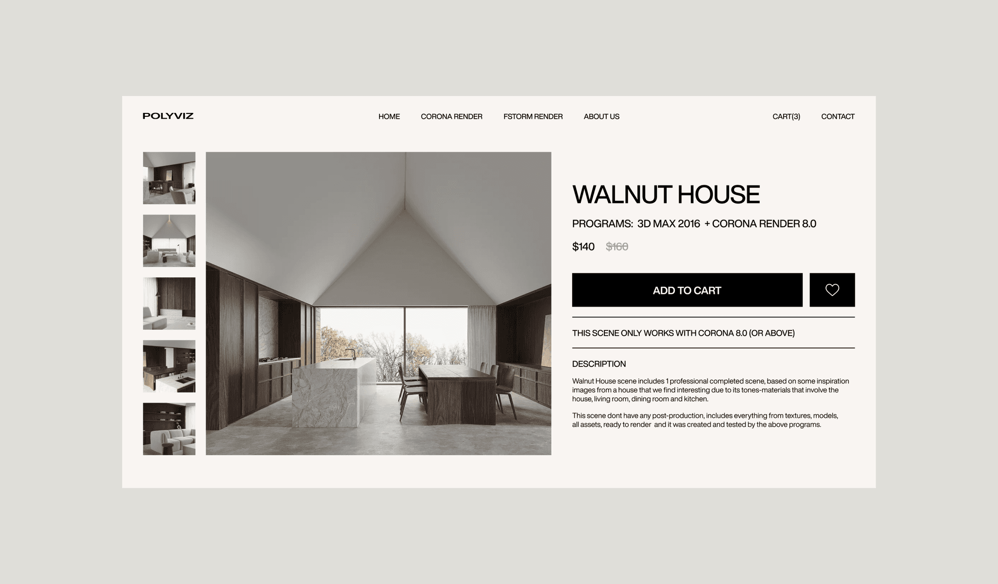
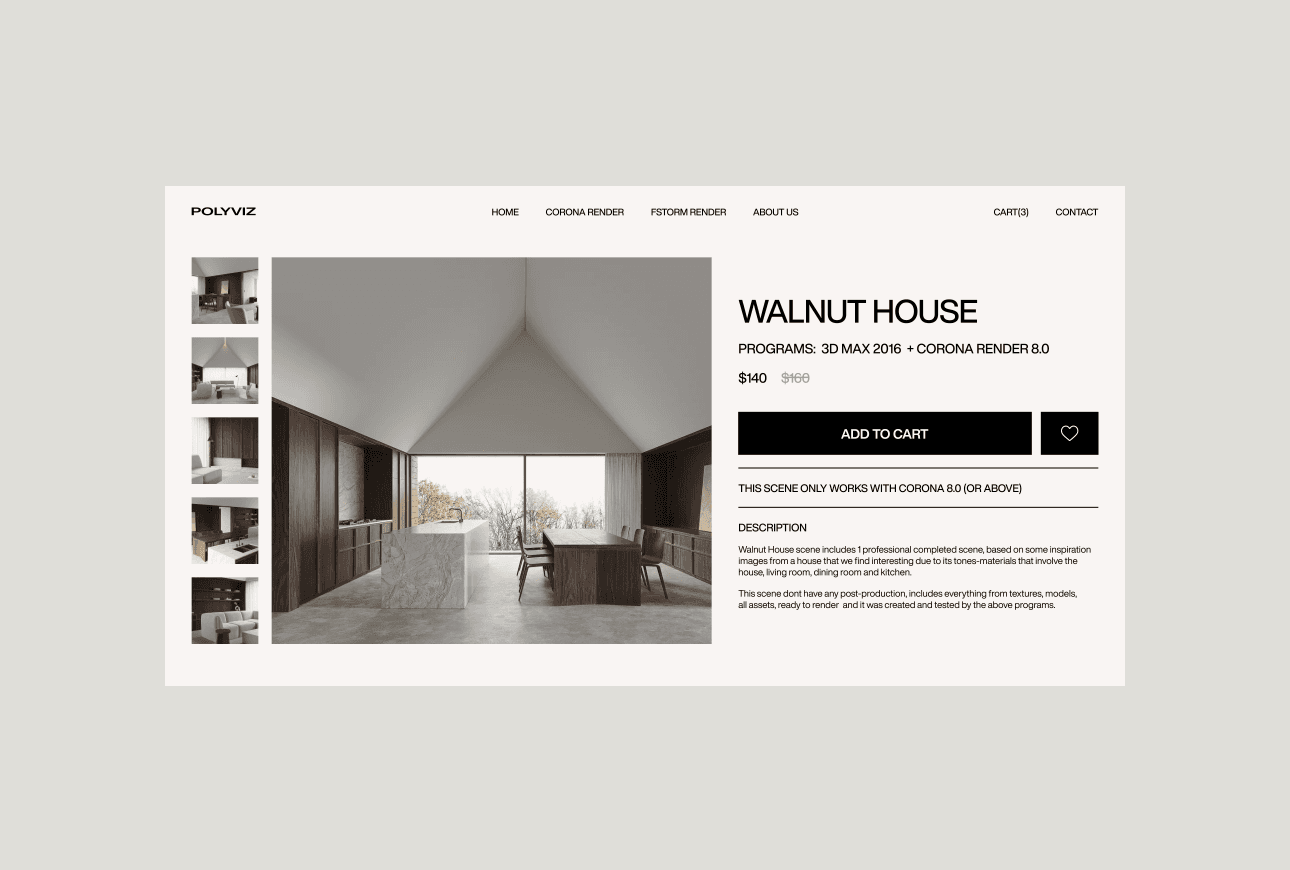
In the purchase section, users had difficulty interacting with key features. Incorrect placement and design of elements created confusion and made it difficult to perform basic actions such as adding to favorites and purchasing scenes.
Solution:
I redesigned the section to ensure clarity and interaction. This method optimizes the placement and visual design of elements to make key actions more accessible and understandable, improve usability, and reduce the risk of errors.

Examples of screens for transferring money and crypto
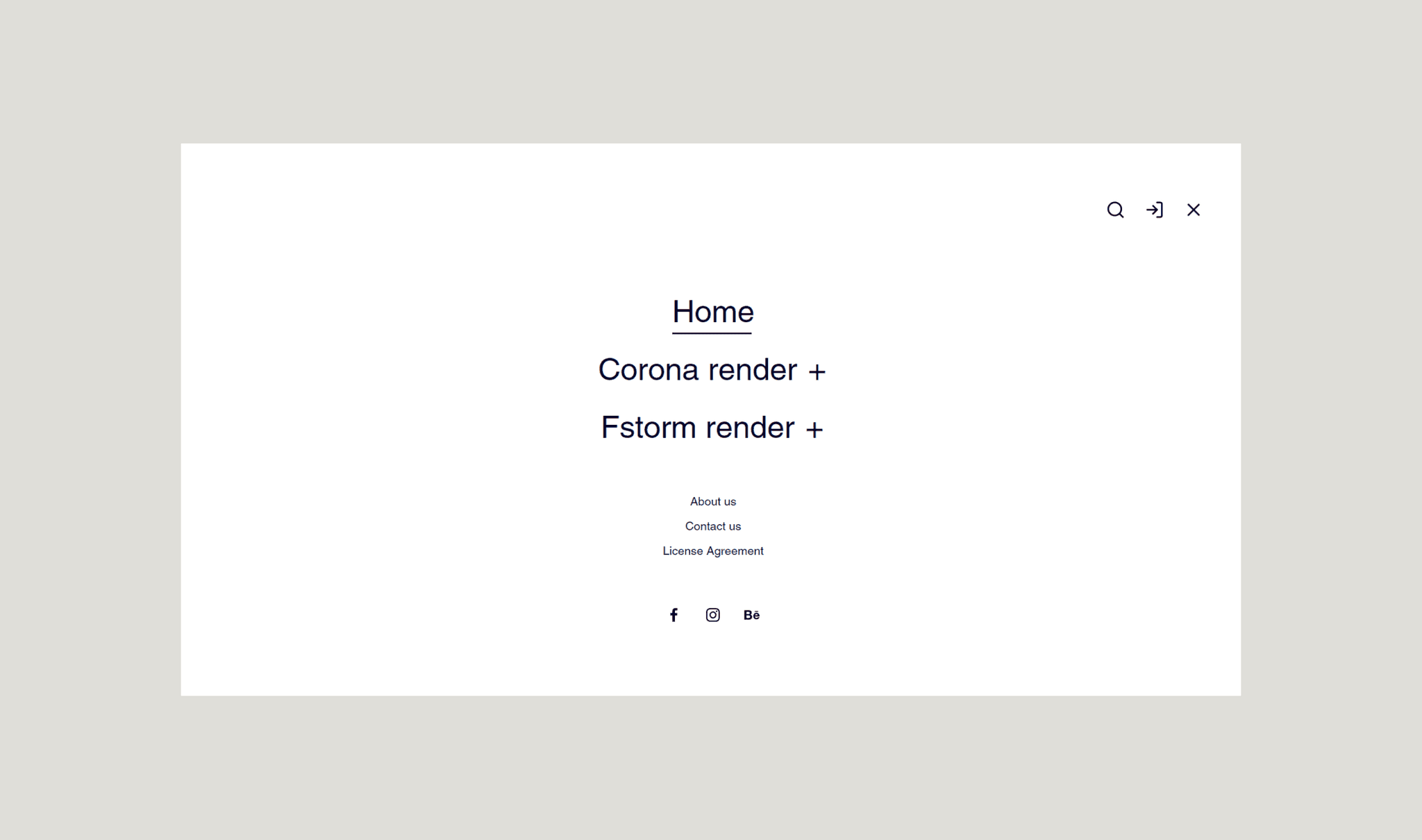
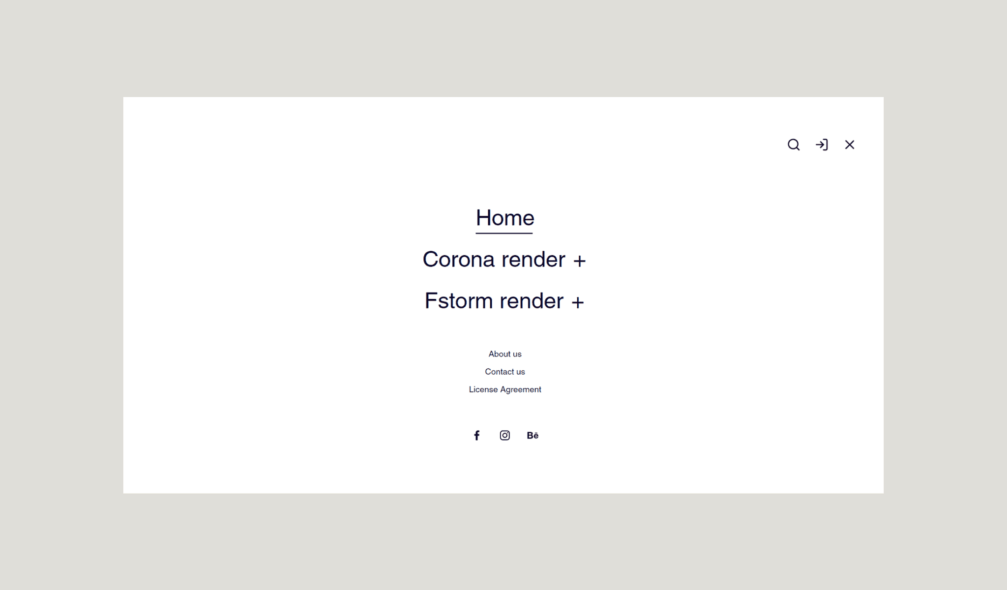
Navigation:
Problem:
Users may have difficulty quickly finding specific scene categories or product details on the website due to a poorly structured navigation menu. This disorganization can lead to confusion and frustration, causing users to spend too much time searching for the information they need.
Solution:
I redesigned the navigation menu to create a more intuitive structure with clearly defined categories and subcategories. By implementing a streamlined menu and adding a prominent search feature, users can now easily find and access specific scenes and products, increasing overall efficiency and satisfaction.
Examples of screens for transferring money and crypto